Web accessibility 101
This post is over two years old, the content may be out of date.
So first of all, what is web accessibility?
Essentially “web accessibility" boils down to making your website functional (and hopefully easy to use) for as many people as possible. Including people with additional challenges such as visual, hearing, mobility or cognitive impairments.
When you're just starting out as a developer it can be easy to dismiss accessibility as something you can figure out "later". Especially when some of the content on the subject seems to require a PHD to decipher!
Today I want to share the TL;DR cheat sheet I wish I'd had for web accessibility earlier. Will doing these things make your entire website accessible for everyone? Unfortunately no, but you can feel better knowing you've got the basics covered. This list will give a beginner the biggest bang for their buck in terms of accessibility.
Let’s get started.
Semantic Markup
Think of your website as a word document with a pre-populated contents page. Would your headings and content structure make sense?
Skip Navigation Link
A “skip-navigation” link should be included at the top of every page. This allows screen reader and keyboard users get straight to the content of your website without having to tab through all of the repetitive items at the top of a page individually (eg navigation menu).
Contrast
There are a range of different visual impairments that will affect how someone views your website. Almost all of them will benefit from a high contrast between the text colour and background colour.
The easiest way to check how your colour combination contrast rates against universal accessibility guidelines is with an online contrast checker. There are many available with a quick google, but this contrast checker is my personal favourite. Hover over the number in the middle and it will give you a pass or fail result. You should try to achieve at least an “AA” rating. 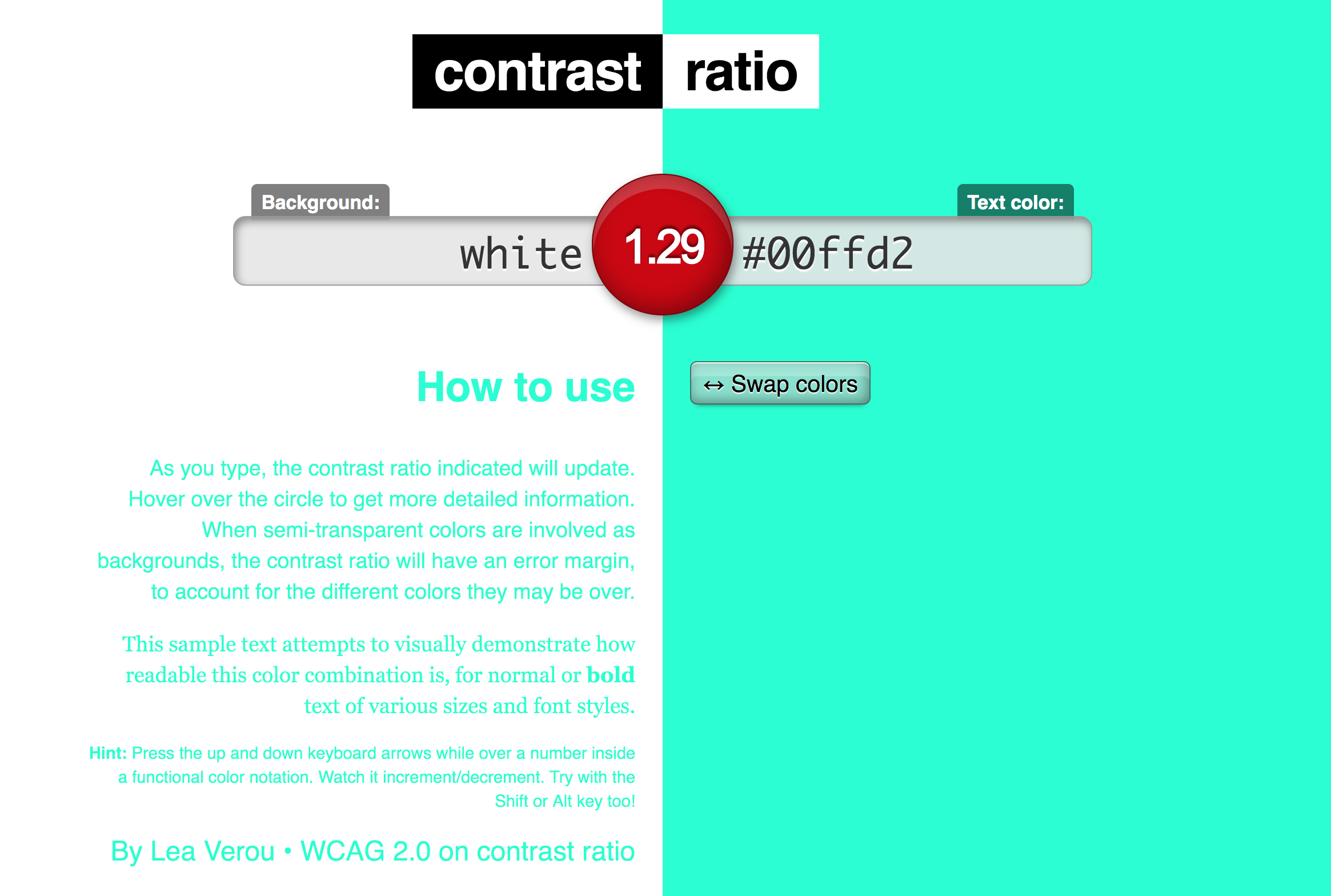
Alternative Text
I expect anyone reading this blog post has probably heard of alt attributes or “alt tags”, but sometimes it can be confusing exactly when they should be used and what they should say.
Here are some simple guidelines:
- Images that are purely decorative (do not convey or contain content) can be given an empty alt attribute (alt=""). Or even better, these images can be implemented through a CSS background.
- All other images should be given a descriptive alternative text and should omit words like "image of" or "graphic of" (the screen reader already declares that it is an image).
An example of an appropriately descriptive alt attribute for the image below would be "man and woman kissing on the beach at sunset".

Text
There are two aspects to accessibility in text (other than contrast). One is the size that you set the text and the other is the units that you set the size with.
Size:
The font size is somewhat tied into the colour contrast in that the larger your text is, the lower the contrast needs to be. It is also recommended that your text is not smaller than 12px as this is considered the minimum size to be accessible.
Units:
Using “absolute” units such as pixels removes the user’s option to increase or decrease the size of the text (without zooming in and out, which will likely break your layout). Using “relative” units such as ems, rems or percentages allows the user to increase the text at an operating system or browser level (and won’t ruin your beautiful layout).
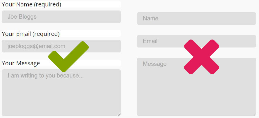
Forms
Always include a label tag for your form elements. Placeholder text is not a replacement for form labels. If design dictates you must break this rule, include the label as visually hidden text for screen readers. If a field is required, indicate this. Use specific input types for email, url, telephone telephone. This will open the most appropriate keyboard or perform the most appropriate action on smart devices.
Buttons
It's common to see a div or span dressed up like a button and even more common to see a button that is actually just a link. Divs, spans and links are not buttons.
- Rule of thumb:
- If it does something like submit a form, use the button element.
- If it navigates somewhere, use the anchor element and css for styling.
Media
Avoid auto playing video or audio, pop-ups and carousels where possible and provide user controls for media. Ever opened multiple browser tabs and suddenly had music blaring from one of them? Imagine not being able to figure out where it was coming from to turn it off.
More Info
So those are the basics, but there is a wealth of information on web accessibility out there if you’re interested to learn more. Some articles, resources and people I recommend include the following:
Twitter Accounts to Follow
Articles/Posts to Read
Reference Material Resources
- The A11y Project Checklist
- Web Accessibility by Google(course)
- Inclusive Design Patterns (book)
- WCAG 2 at a Glance
Happy accessible coding!

Jess is a senior software engineer and web accessibility nerd. When she’s not writing, speaking or tweeting about tech, you’ll find her putting together lego or going on walks with her doggo.